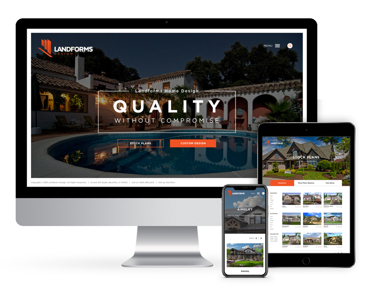
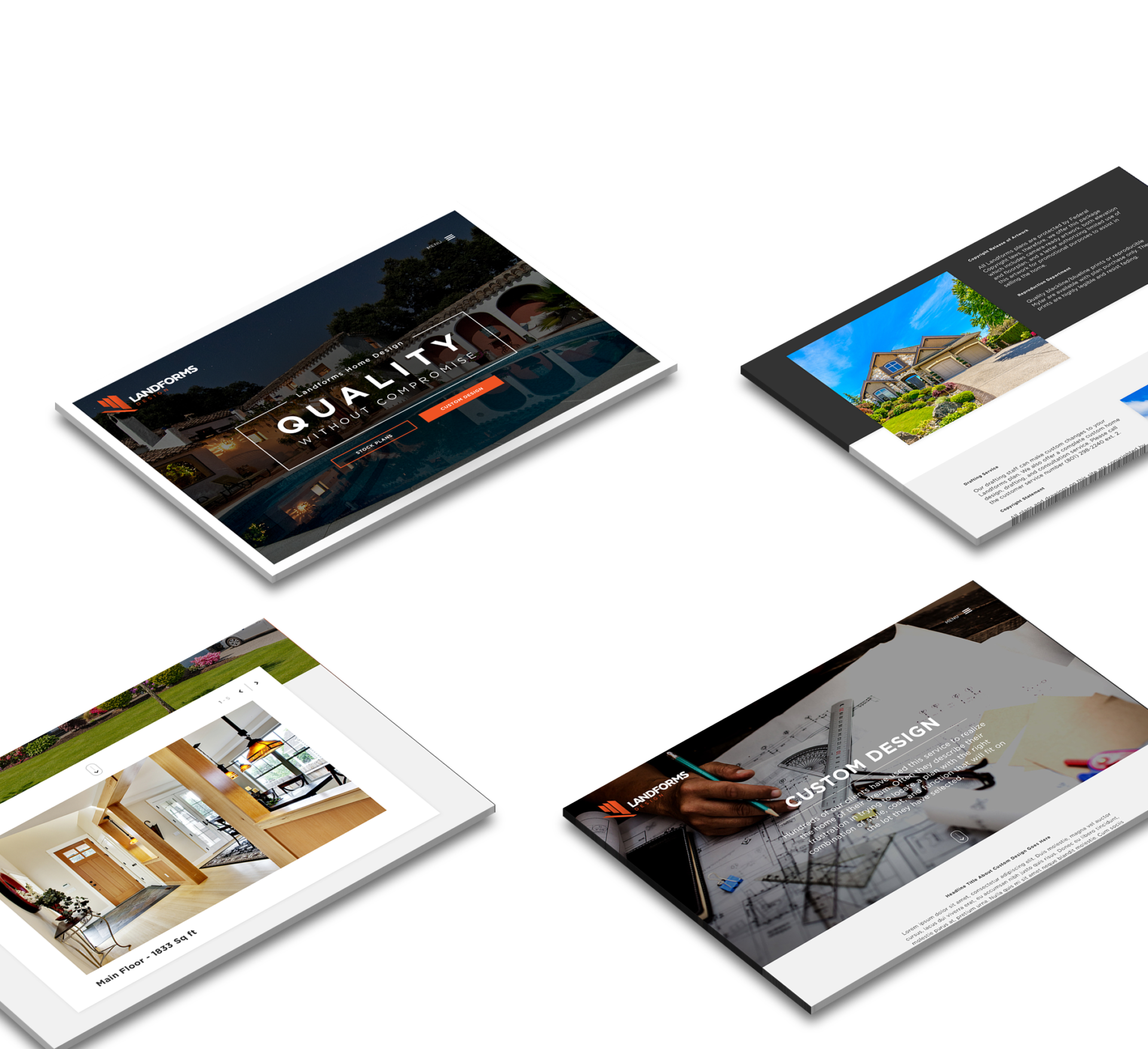
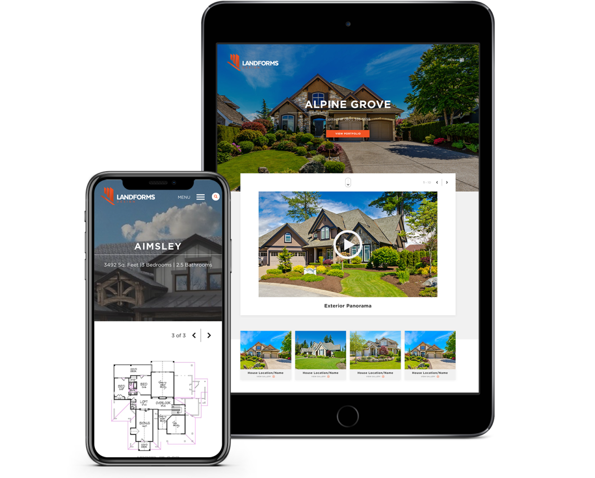
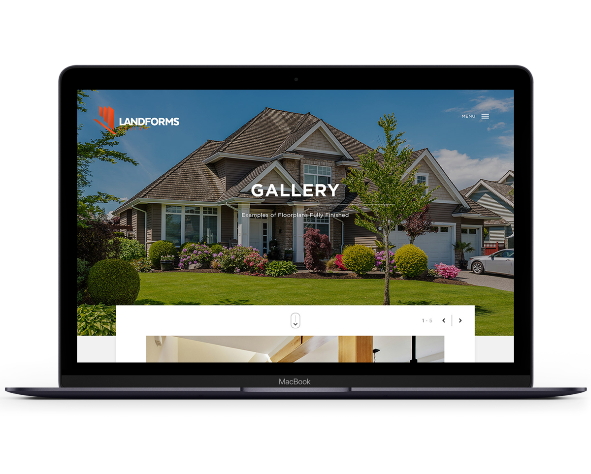
Build a visually-compelling, responsive brochure site that showcases the various work Landforms offers their clients. Executing a website redesign that was user-friendly and easy-to-navigate was critical during every part of the design and development stages. Now the site has all the elements needed to get clients what they need without having to navigate through any unnecessary steps.
Creating a better homebuyer experience
The Objective and Challenge


User-Driven Decisions
A simple and clean site layout perfectly showcases the client’s work with heavy imagery and easy to navigate product options. Being able to view in detail different renderings, real life photos, and floor plans for both custom and stock housing options provides the user to do their due-diligence in the home buying experience.


Retrospection
Adding a specified builders page highlights the renown builders they’ve worked with giving credible recommendations to their customers.